
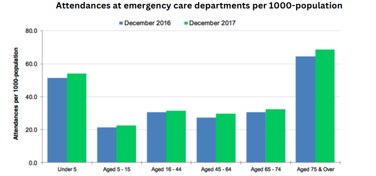
[Line Graph] Meat and poultry consumption line graph
The graph below shows trends in US meat and poultry consumption

The provided graph compares the consumption levels of four different types of meat and poultry per capita in the United States between 1955 and 2012.
Overall, beef was the most popular choice in general over the period, except between 2009 and 2012, where broilers began to take the lead. Pork and turkey consumption, on the other hand, observed relatively little net change over the years.
In 1955, beef consumption was recorded at just under 60 pounds per capita whereas each person consumed around 10 pounds less for pork in the same year. Over the next two decades, however, consumption levels for both types of meat followed completely different trajectories. Specifically, the amount of beef consumed continued to rise and peaked at 90 pounds per capita in 1976, while the figures for pork were more erratic, registering a net decrease to just under 40 pounds per capita.
From 1976 onwards, people consumed less beef, and this figure declined drastically, hitting a trough in 2012 at just 50 pounds per capita, aligning with pork consumption in 1955. For pork, despite being able to continually reach initial consumption levels, its figures dropped slightly towards the final few years to above 40 pounds per capita.
The amount of broilers and turkey eaten was not recorded until 1961, where the former stood at under 20 pounds per capita, while the latter was less than half of that. Both types observed an uptick in popularity, but it was clear that broiler was the more popular choice. At its peak in 2006, people consumed around 60 pounds of broiler per capita, whereas the consumption of turkey only rose slightly by 10 pounds after 1988, and saw little change after.
Responses