
[Bar Graph] Visits to a community website
The provided bar graph illustrates the number of visits to a community website during its first and second years of operation. It is clear that…

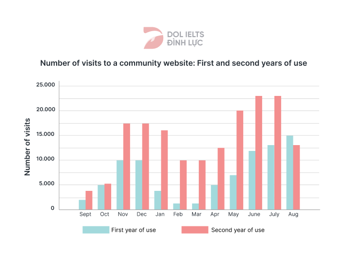
The provided bar graph illustrates the number of visits to a community website during its first and second years of operation. It is clear that…
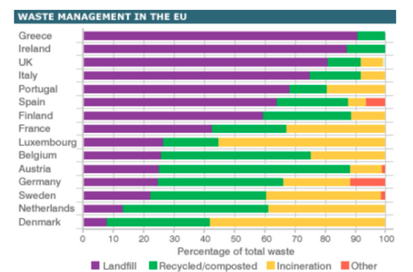
The chart below compares levels of recycling, as well as some less environmentally friendly forms of waste management, in fifteen European countries. The bar chart…
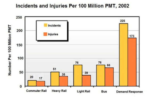
The chart below shows numbers of incidents and injuries per 100 million passenger miles travelled (PMT) by transportation type in 2002. The bar chart provides…
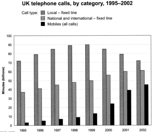
The chart below shows the amount of time people in the UK spent by three different categories between 1995 to 2002 The provided bar chart…

The chart below shows the amount of time that 10 to 15-year-olds spend chatting on the Internet and playing on games consoles on an average…
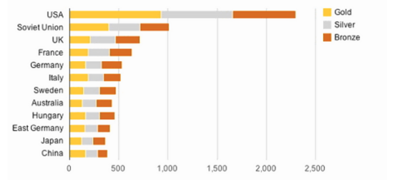
The chart below shows the total number of Olympic medals won by twelve different countries. The bar chart offers a comparison of twelve nations based…
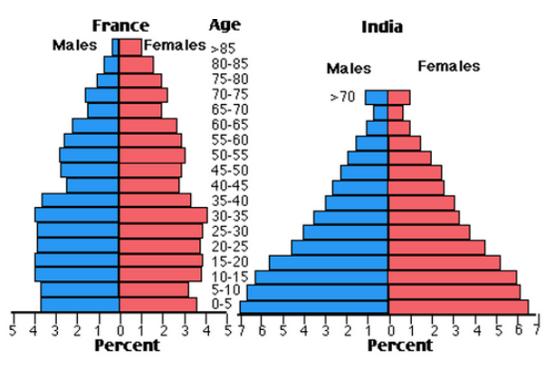
The charts below compare the age structure of the population of France and India in 1984. The two charts provide a comparative analysis of age…
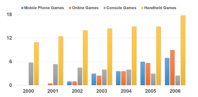
The bar graph shows the global sales (in billions of dollars) of different types of digital games between 2000 and 2006. The bar chart illustrates…
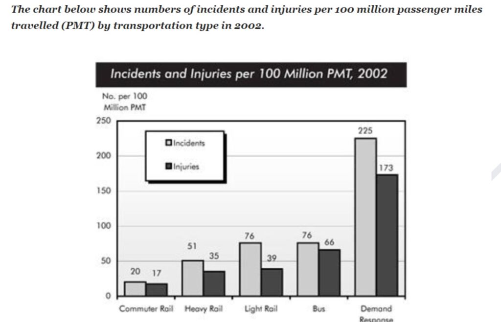
The bar graph compares the statistics of incidents and injuries per 100 million passenger miles traveled in 2002. Overall, most incidents and injuries occurred for…
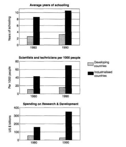
The charts below show the levels of participation in education and science in developing and industrialised countries in 1980 and 1990. The three bar charts…