
[Line Graph] Prefered modes of transportation for commuters Line graph
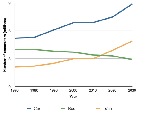
The graph below shows the average number of UK commuters travelling each day by car, bus or train between 1970 and 2030.
Plan:
Ở bài này ta cũng sẽ chia các số liệu chủ yếu ra 3 mốc thời gian: 1970, 2000, 2030
- Năm 2000 là cột mốc quan trọng vì nó nằm giữa khoảng thời gian được nhắc tới.
- Đồng thời, đây cũng là năm đánh dấu sự thay đổi ban đầu cho cả 3 đối tượng.
Structure:
- Body 1: Dùng câu đầu để nói về các số liệu của cả 3 phương tiện. Tương tự như một số bài khác thì ta cần viết 2 câu đổ lên để hình thành 1 body, vì vậy ta sẽ gộp cột mốc 2000 vào luôn.
- Body 2: Ở body cuối ta sẽ so sánh những thay đổi trong tương lai (nhớ dùng thì tương lai).
The line graph depicts data on daily commuting patterns of UK workers using three different modes of transportation over a span of 60 years. It is evident that the car consistently emerges as the most favored mode of transport for UK commuters throughout the entire period. Additionally, while the usage of cars and trains witnesses gradual increases, the number of bus commuters steadily declines.
In 1970, approximately 5 million UK commuters opted for daily car travel, while around 4 million and 2 million people utilized buses and trains, respectively. By the year 2000, the number of individuals driving to work surged to 7 million, and the count of train commuters reached 3 million. However, there was a slight decrease of about 0.5 million in the number of bus users.
Looking ahead to 2030, it is projected that the number of car commuters will nearly reach 9 million, and the number of commuters using trains is expected to rise to almost 5 million. In contrast, buses are anticipated to witness a decline in popularity, with only 3 million daily users.


Responses