
[Bar Graph] WT1 Sample: Transport spending bar chart (07/08/23)
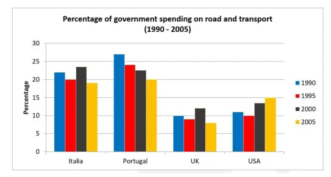
The provided bar chart illustrates the differences in transport expenditures for 4 different areas from 1990 to 2005. Overall, it can be seen that Portugal and Italy were the bigger spenders when it came to road and transport over the 25-year period.
To start, transportation expenses were at its peak for Portugal in 1990, totalling over 25%. However, this number steadily dropped over the years and bottomed out at exactly 20% at the end of the period. For Italy, their transport expenditure was always lower than that of Portugal for all years except 2000, when it peaked at just under 25%.
In comparison, traffic spendings started at a relatively similar rate of approximately 10% for both the US and the UK . While both country followed a generally increasing trend in the first 20 years, transportation funding in the UK sharply plummeted in 2005, compared to a steady increase for the US.

Responses