
[Line Graph] British Unemployment Rates Line graph
The graph below shows changes in young adult unemployment rates in England between 1993 and 2012. The provided line graph compares the percentage of unemployed…
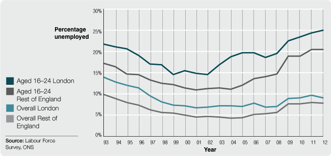
The graph below shows changes in young adult unemployment rates in England between 1993 and 2012. The provided line graph compares the percentage of unemployed…
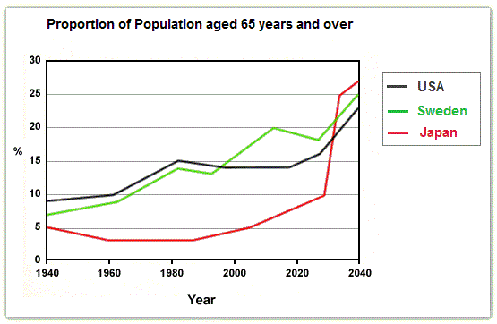
The graph below shows the proportion of the population aged 65 and over between 1940 and 2040 in three different countries. The line graph compares…
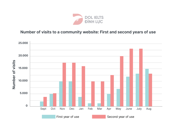
The provided bar graph illustrates the number of visits to a community website during its first and second years of operation. It is clear that…
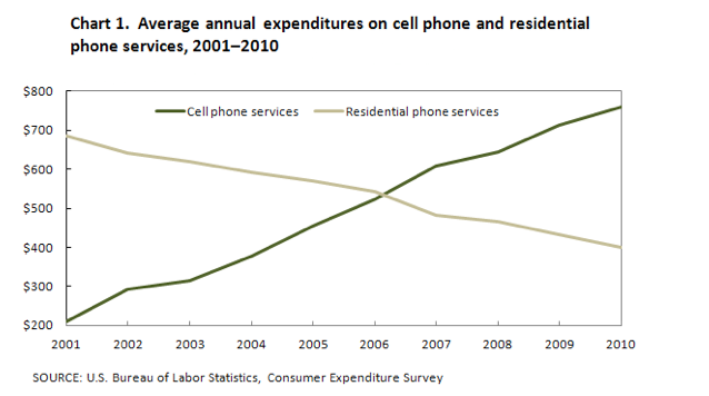
The following chart compares annual expenditures on cell phone and residential phone services from 2001 to 2010 Plan: Đây là một line graph khá đơn…
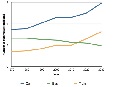
The graph below shows the average number of UK commuters travelling each day by car, bus or train between 1970 and 2030. Plan: Ở bài…
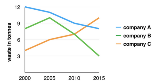
The graph below shows the amounts of waste produced by three companies over a period of 15 years. Plan Ở đây chúng ta có 3…
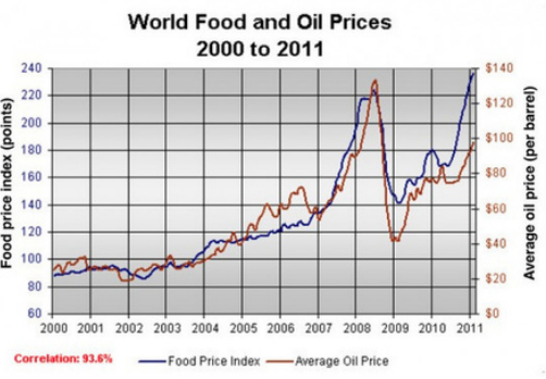
The graph below shows changes in global food and oil prices between 2000 and 2011. Plan: Structure: The provided line graph compares the differences between…
The line graph compares the proportion of unemployed young adults in England over a period of 19 years. Overall, London generally witnessed a higher rate…
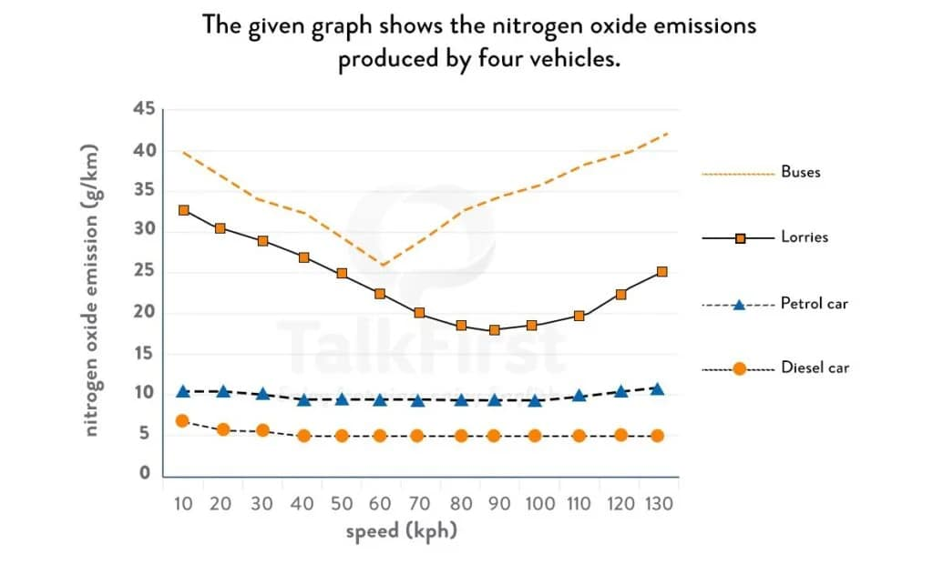
The provided line graph compares the differences in the level of nitrogen oxide emitted by 4 types of transportation. Overall, it can be seen that…

The graph below shows trends in US meat and poultry consumption The provided graph compares the consumption levels of four different types of meat and…