
[Pie Chart] Distribution of tourist to attractions in UK
The provided chart illustrates how visitors to an array of British tourist destinations were distributed in 1999. Overall, theme parks appeared to be the most…
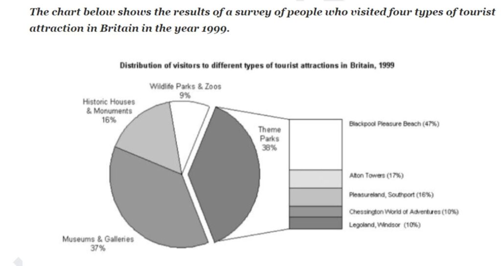
The provided chart illustrates how visitors to an array of British tourist destinations were distributed in 1999. Overall, theme parks appeared to be the most…
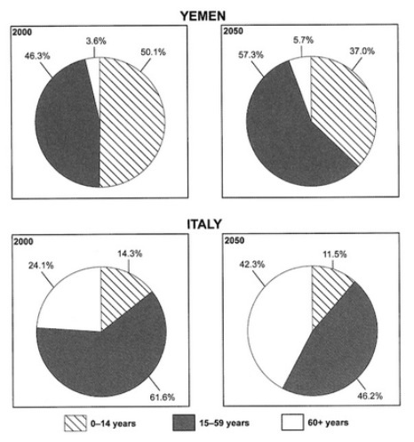
The charts below give information on the ages of the populations of Yemen and Italy in 2000 and projections for 2050 The pie charts present…
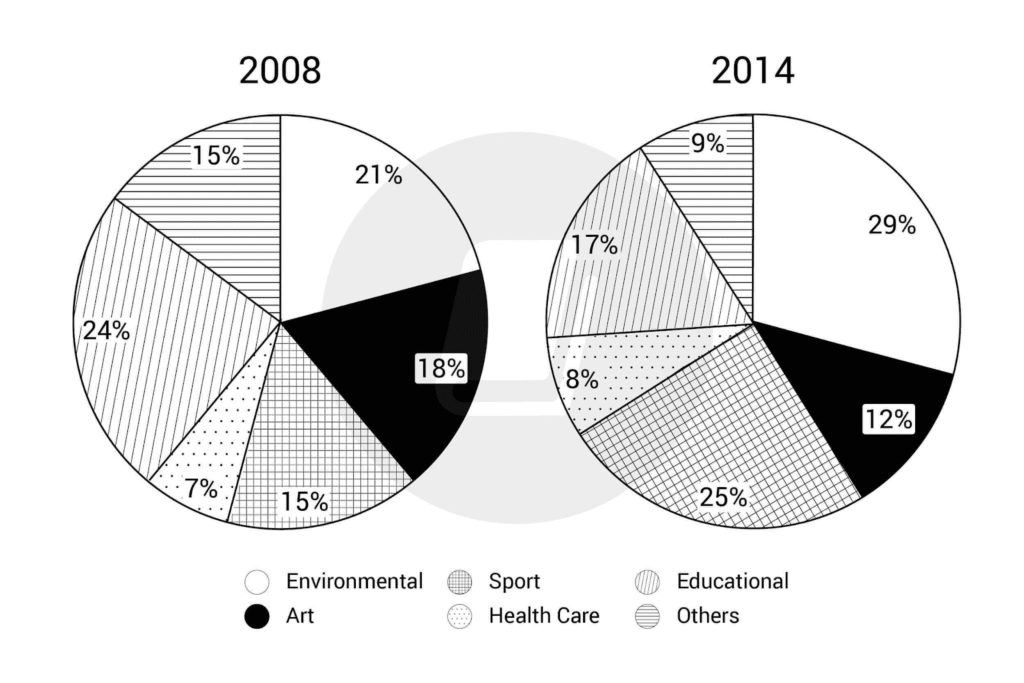
The charts show the percentage of volunteers by organizations in 2008-2014 The given pie charts provide information about the proportion of people from different organizations…
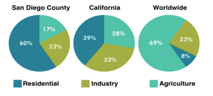
The pie charts below compare water usage in San Diego, California and the rest of the world. The provided pie charts illustrate how different regions…

The three pie charts below show how the changes in annual spending by a particular UK schools in 1981, 1991, and 2001. The pie charts…

The provided pie chart compares ratings of patrons to a hotel based on its customer service over a 5-year period. Overall, while the majority of…