
[Pie Chart] The three pie charts below show how the changes in annual spending by a particular UK schools in 1981, 1991, and 2001.
The three pie charts below show how the changes in annual spending by a particular UK schools in 1981, 1991, and 2001.
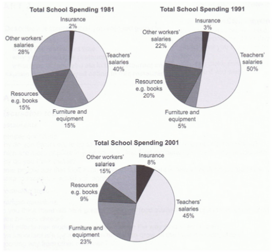
The pie charts illustrate the expenditure of a UK school across three different years spanning a 20-year period. It is evident that teachers’ salaries consistently constituted the largest proportion of the school’s spending in 1981, 1991, and 2001, while insurance consistently represented the smallest cost.
In 1981, teachers’ salaries accounted for 40% of the school’s budget but it increased to 50% a decade later before slightly decreasing by 5% in 2001. Conversely, expenditure on other workers’ wages declined steadily over the 20-year period, from comprising 28% of the budget in 1981 to only 15% 20 years later.
In comparison, insurance expenses constituted only 2% of the total budget in 1981 but escalated to 8% by 2001. Meanwhile, percentages for resources such as books and furniture/equipment fluctuated. Specifically, expenditure for resources peaked at 20% in 1991 and spending on furniture and equipment reached its highest value a decade later, at 23%.
151 Words – Band 8.0


Responses