
[Bar Graph] The chart below shows the amount of time people in the UK spent by three different categories between 1995 to 2002
The chart below shows the amount of time people in the UK spent by three different categories between 1995 to 2002
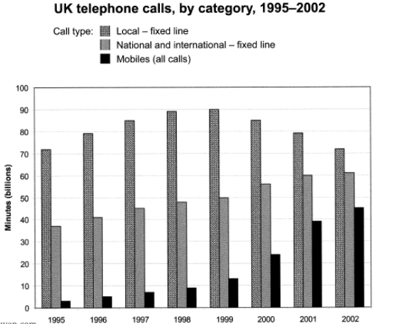
The provided bar chart compares how much time individuals in the UK spent on three distinct types of phone calls spanning from 1995 to 2002.
Notably, calls conducted through local fixed lines maintained dominance in terms of overall usage throughout the depicted period. Conversely, mobile calls, while starting with the lowest figures, experienced the most significant surge in user minutes.
In 1995, local fixed lines registered a substantial usage of over 70 billion minutes, with approximately half that duration attributed to national or international calls. In sharp contrast, mobile phone usage accounted for a mere 4 billion minutes. Over the subsequent four years, there was a consistent increase in usage for all three categories of phone calls.
By 1999, local fixed line calls peaked at 90 billion minutes. However, this figure saw a subsequent decline, while the usage for national/international landline and mobile calls continued to ascend. In 2002, the minutes spent on national/international landline calls surpassed 60 billion, while mobile usage escalated to approximately 45 billion minutes.
(170 Words – Band 8.0)


Responses