
[Pie Chart] The charts show the percentage of volunteers by organizations in 2008-2014
The charts show the percentage of volunteers by organizations in 2008-2014
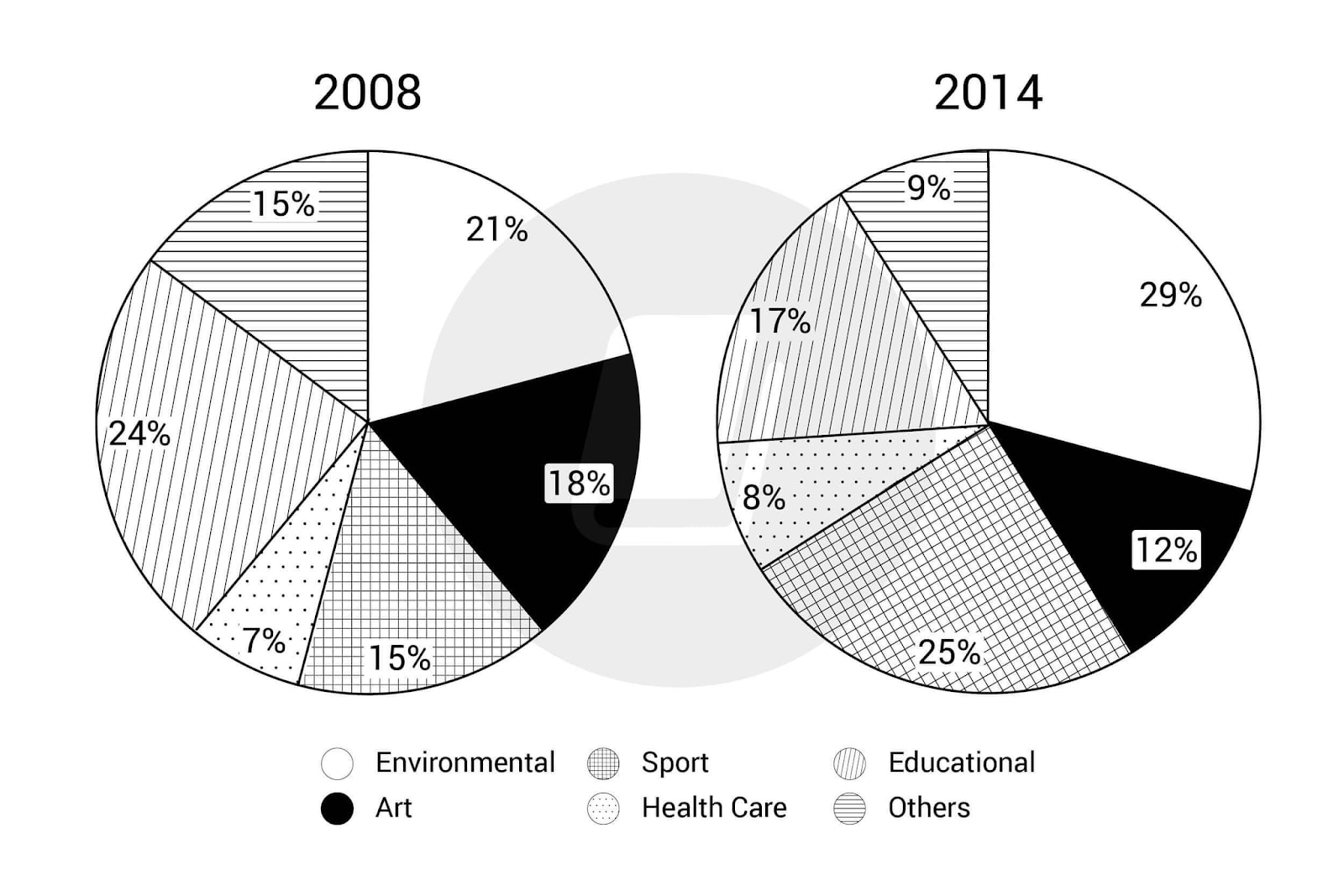
The given pie charts provide information about the proportion of people from different organizations who volunteered in 2008 and 2014. Overall, while the percentages of volunteers from environmental, sports and health care organizations increased over the 6-year period, the rest declined.
In 2008, 24% of all volunteers came from an educational background, topping the chart. This was followed by those who worked in environmental and art companies at 21% and 18%, respectively. In contrast, people working in health care volunteered the least, with only 7% of all volunteers coming from this section. Finally, the figure for sport and other types of organizations were similar, at 15%.
6 years later, the percentage of educational workers who volunteered went down by 7%, while that of environmental organizations accounted for 29%, making them the leading sector in 2014. Following this was volunteers from sport, which saw the most significant increase of 10% among all sectors. In comparison, the statistics for art and other organizations both dropped by 6% while that of health care rose marginally but stayed at the bottom of the list.


Responses