
[Line Graph] Annual Phone Expenditures Line Graph
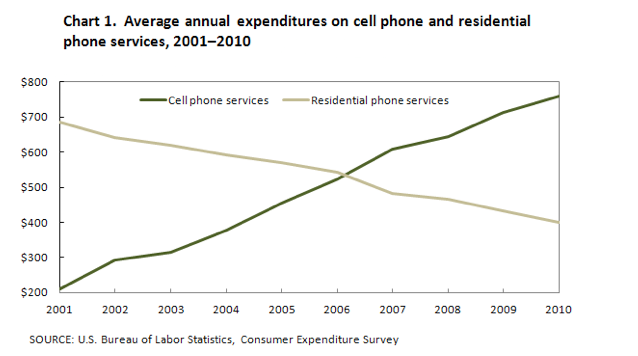
The following chart compares annual expenditures on cell phone and residential phone services from 2001 to 2010
Plan:
Đây là một line graph khá đơn giản, chỉ có 2 đường, vì vậy ta không nên chỉ nói điểm đầu (2001) và điểm cuối (2010), mà ngoài ra còn nên nói về điểm giao ở năm 2006.
Structure:
- Body 1: Đối với đa số các bài graph, chúng ta nên dùng body 1 để so sánh về điểm bắt đầu của chúng. Nhưng với bài này, vì chỉ có 2 đối tượng, ở body 1 ta cũng nên nói thêm về sự thay đổi của chúng ở nút giao 2006 (vì như vậy mới viết được 2 câu và mới tách ra body riêng được)
- Body 2: Mặc dù đến năm 2006 thì người Mỹ trả đều cho cả 2 dịch vụ này, nhưng 4 năm sau đó thì ta thấy có sự đối nghịch giữa 2 cái, một cái đi lên và một cái đi xuống. Các sự đối nghịch này là cơ hội tốt để ta dùng các cấu trúc như while, however để lấy thêm điểm so sánh.
The line graph illustrates the annual average spending by Americans on mobile and landline phone services from 2001 to 2010. Overall, there was a consistent decline in expenditure on landline phones throughout the decade, while spending on mobile phones increased rapidly. The pivotal point occurred in 2006 when mobile services expenditure surpassed that of residential phone services.
In 2001, the average annual spending on residential phone services was nearly $700, while spending on cell phone services was only around $200. Over the subsequent five years, the yearly average expenditure on landlines decreased by almost $200. In contrast, spending on mobile phones saw an increase of approximately $300 during the same period.
By the year 2006, the average American spent just over $500 on both types of phone services. However, by 2010, spending on mobile phones had risen to around $750, whereas expenditure on residential services had declined to just over half of this amount.
(155 Words – Band 8.0)


Responses