
[Line Graph] Population aged 65 and over line graph
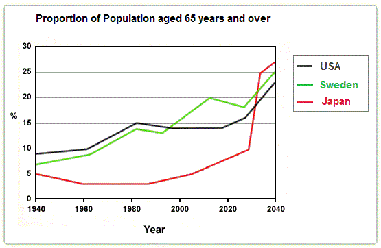
The graph below shows the proportion of the population aged 65 and over between 1940 and 2040 in three different countries.

The line graph compares the proportion of population over 65 years of age in three different nations over a one-hundred-year period.
Overall, the percentage of seniors among all three countries are expected to rise between 2020 and 2040. Of these countries, Japan is predicted to see the most vigorous growth in the period, despite registering record-low figures prior to 2020.
In 1940, this age bracket amounted to just under 10% of the US population and 7% in Sweden, while in Japan it was most negligible at just 5%. In the following 40 years, figures for The USA and Sweden mirrored each other in that they both increased dramatically after 1960 following a period of minimal growth. For the US, this number rose to 15% in 1980, while Sweden continued to lag slightly behind at around 13%. In the same period, however, Japanese figures declined slightly and remained unchanged until the late 1980s.
From 1980 onwards, the USA and Sweden followed slightly different trajectories, while the Swedish elderly population experienced more vigorous growth, resulting in a spike to 20% around 2010, US figures saw relatively little change after dropping off slightly. By 2040, however, it is predicted that both lines would have converged, accounting for 25% and 23% of the Swedish and American population, respectively. Japanese rates, in contrast, registered a steady uptick after 1980 before climbing exponentially, amounting to a staggering prediction of 28% of the population by 2040.


Responses