
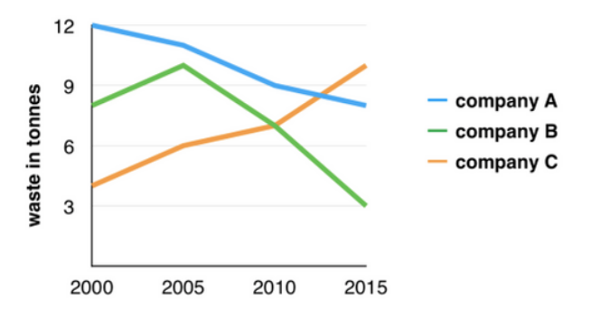
[Line Graph] Waste Produced by 3 companies
The graph below shows the amounts of waste produced by three companies over a period of
15 years.
Plan
Ở đây chúng ta có 3 đối tượng, và chúng có sự thay đổi không quá đặc biệt, nên vấn đề lớn ở đây chính là tìm cách viết đủ 150 từ. Ở đây ta có 2 mốc thời gian chính, mốc 1 từ 2000 đến 2005, mốc 2 từ 2005 đến 2015.
Structure:
- Body 1: Ở đây chúng ta sẽ liệt kê và so sánh từng đối tượng ở năm 2000, nhưng thông tin này chỉ viết được một câu, vì vậy cùng body này ta sẽ thêm vào những thay đổi 5 năm sau đó.
- Body 2: Trong phần 2 ta sẽ nói thêm những chuyển biến của các đối tượng từ 2005 đến 2015, tuy nhiên ta sẽ thêm phần “by 2015” để viết thêm về điểm kết thúc của nó. Ngoài ra ta còn có thể nhắc đến việc công ty C vượt mặt công ty A trong cùng khoảng thời gian.
The line graph illustrates the waste output of three companies from the years 2000 to 2015. Overall, companies A and B experienced a decline in waste output, while the amount of waste produced by company C witnessed a significant increase.
In 2000, company A generated 12 tonnes of waste, while companies B and C produced approximately 8 tonnes and 4 tonnes of waste, respectively. Over the next 5 years, the waste output of companies B and C increased by about 2 tonnes, while the figure for company A decreased by approximately 1 tonne.
From 2005 to 2015, company A reduced its waste production by approximately 3 tonnes, and company B decreased this output by around 7 tonnes. In contrast, company C observed a rise in waste production of about 4 tonnes over the same 10-year period, exceeding that of company A. By 2015, company C’s waste output had increased to 10 tonnes, while the respective amounts of waste from companies A and B had declined to 8 tonnes and only 3 tonnes accordingly.


Responses