
[Line Graph] WT1 Sample: Nitro emission line graph – needs redoing
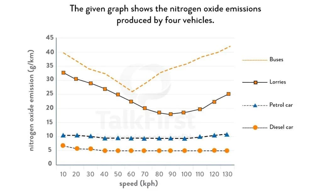
The provided line graph compares the differences in the level of nitrogen oxide emitted by 4 types of transportation. Overall, it can be seen that nitrogen emission from buses and lorries tend to drop as these vehicle reach moderate speed, but rise again as they get to higher velocity. Petrol and diesel cars, on the other hand, share the attribute that they their emission levels stay relatively unchanged with speed.
Buses has the highest level, at more than 25g/km for all speeds. The emission for this type of vehicle first drops from the level of 40g/km at 10 kph all the way to the bottom when it reaches 60kph. After said speed, it started emitting more nitrogen oxide until reaching a peak at 130kph. Similarly, lorries starts with a high of around 32g/km and gradually level off as it picks up speed. The difference, however, is that emission from lorries starts bottoming out at 90kph, much higher than that of buses.
Gasoline and diesel cars both have a low and stable level of nitrogen emission. While gasoline cars generally push out just around 10g/km overall, its diesel counterparts release roughly half of that.


Responses