
[Bar Graph] WT1 Sample: Weekly family spendings bar chart (08/08/23)
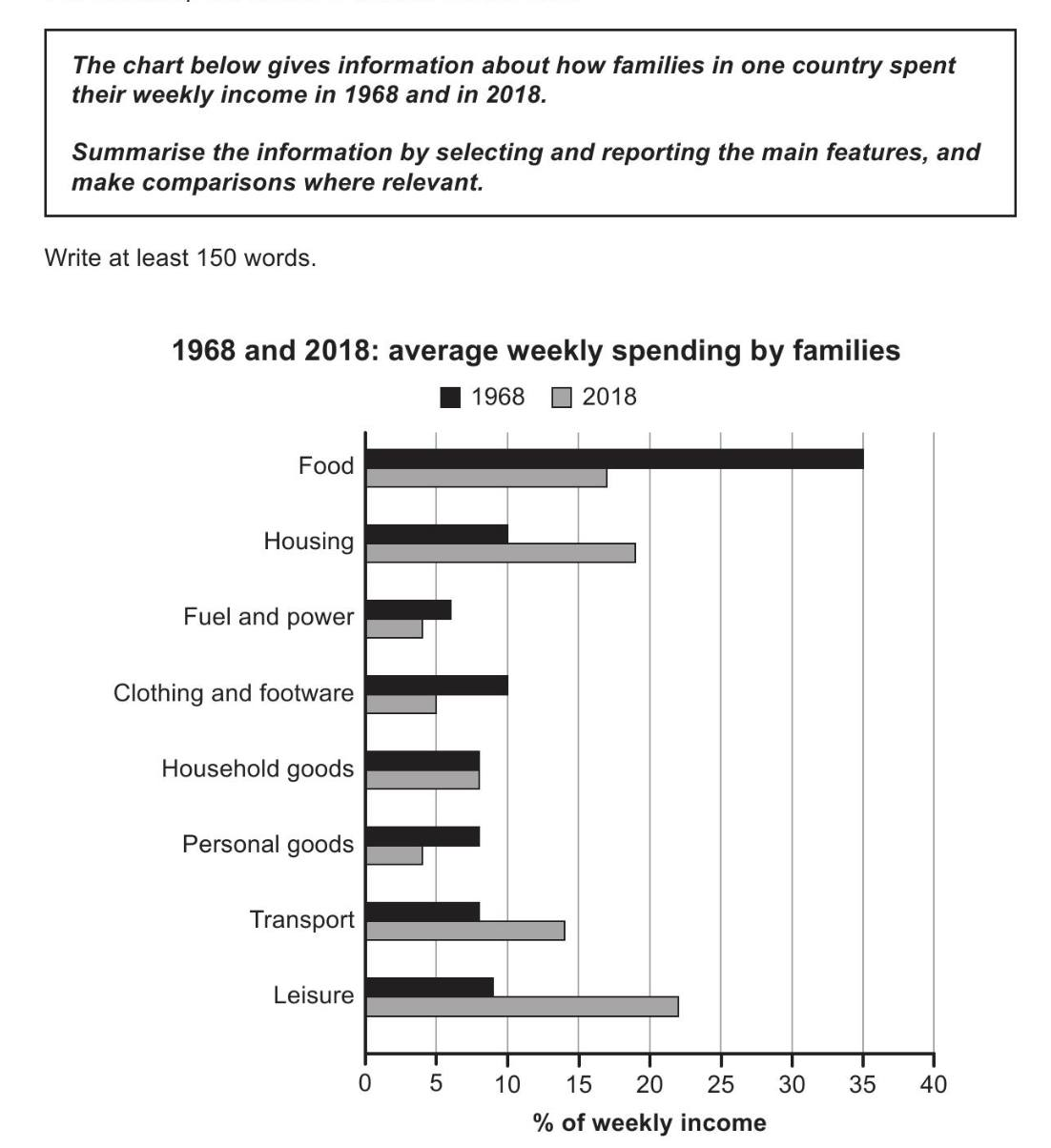
The provided bar chart illustrates the changes in weekly expenditure of households in one country in 1968 and 2018. Overall, while typical families spent the largest proportion of their income on food in 1968, we began to see this shifting to housing and leisure 50 years later.
To start, households generally spent around 35% of their weekly earnings for food in 1968. However, this number dropped rapidly by half at the dawn of 2018. Housing and leisure on the other hand, despite only taking up around 10% each initially, rose to roughly 18% and 22% ,respectively, half a century later.
In comparison, transport, being another sizable category in 2018, saw a considerable increase from its original value to just under 15%. The remaining expenditures, however, generally hovered between 5% to 10%. Of this, fuel and power, personal goods and clothing all dropped from their initial figures, while household goods was the only category that remained unchanged over the years.


Responses