
[Bar Graph] WT1 Sample: Transport spending bar chart (07/08/23)
The provided bar chart illustrates the differences in transport expenditures for 4 different areas from 1990 to 2005. Overall, it can be seen that Portugal…
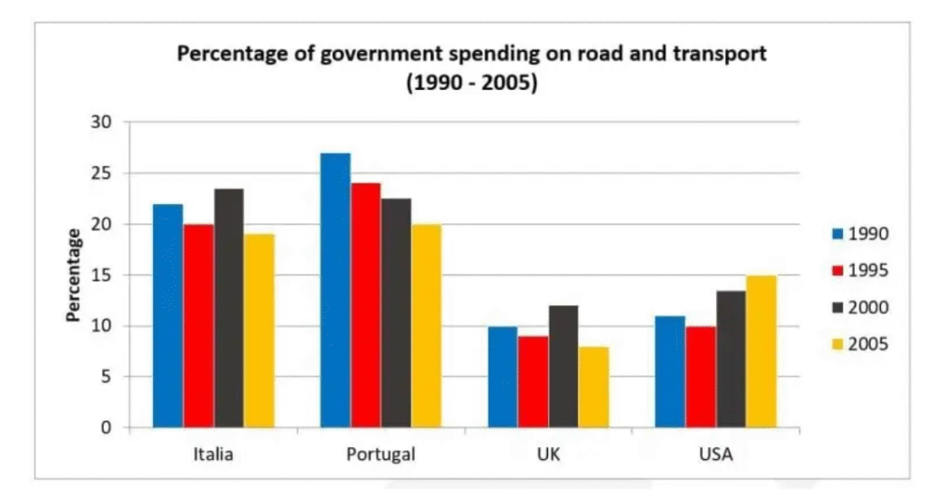
The provided bar chart illustrates the differences in transport expenditures for 4 different areas from 1990 to 2005. Overall, it can be seen that Portugal…
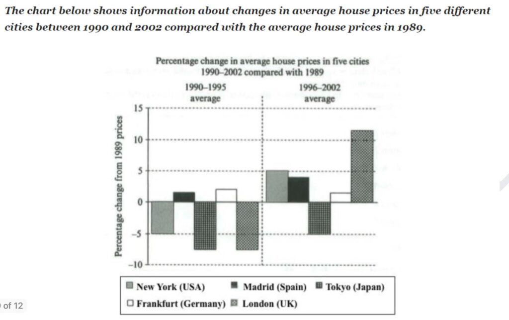
Plan: Note: ở bài này các số liệu đều được so sánh với điểm gốc là 1989, vì vậy nên lưu ý cách dùng từ.…
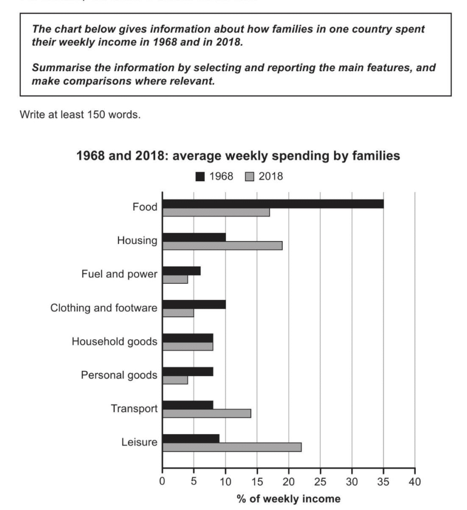
The provided bar chart illustrates the changes in weekly expenditure of households in one country in 1968 and 2018. Overall, while typical families spent the…
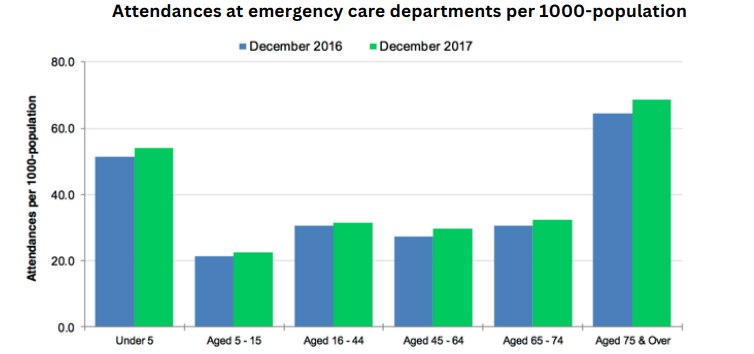
The chart below shows figures for attendances at hospital emergency care departments in Northern Ireland by age group in December 2016 and December 2017. The…
The graph below shows the proportion of the population aged 65 and over between 1940 and 2040 in three different countries. The line graph compares…
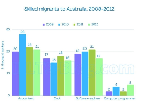
The chart below gives information on the numbers of workers in different occupations who migrated to Australia between 2009 and 2012 The provided bar graph…

The graph below shows trends in US meat and poultry consumption The provided graph compares the consumption levels of four different types of meat and…

The graph below shows the number of tourists visiting a particular Caribbean island between 2010 and 2017. The graph provides information about visitors to a…
Prompt – Câu hỏi: Describe a climate you would like to live in Band 8.0 Sample – Bài mẫu: I’d absolutely love to live in…